


Colour is the first thing the eye registers in a room and the dhurrie is often the largest single field of colour on the floor. Get it right and the rug draws the whole scheme together, making the walls, the upholstery, and the light feel deliberate. Get it wrong and the most beautifully woven piece will fight the room, reading as an interruption rather than a foundation. Yet colour is the decision most often made on instinct alone, chosen from a swatch in isolation rather than against the space it has to live in.
This guide gives you a framework instead of a guess. It works through the fixed elements you should be matching to, how to pair a dhurrie with your sofa and walls, what light and dark rugs do to a space, and when to be bold versus restrained room by room. By the end you will be able to choose a dhurrie colour with the same confidence you would bring to choosing its dhurrie size.
Why Dhurrie Colour Is a Bigger Decision Than It Looks

A dhurrie is not an accessory you change with the seasons. A well-made handloom flatweave is an investment meant to last decades, which means its colour has to work not just with the room you have now but with the rooms it will pass through over its life. That permanence is exactly why the colour deserves more thought than a cushion or a throw it is the one large, lasting colour decision on the floor.
Colour also does spatial work. Lighter dhurries open a room out and lift it; deeper tones draw it in and ground it. A rug that picks up an existing accent in the room ties the scheme together, while a rug in a wholly unrelated palette reads as a stray element no matter how lovely the weave. Before you fall for a particular shade, the more useful question is what you want the colour to do for the space.
Start With the Room's Fixed Elements
The most reliable way to choose a dhurrie colour is to work from what cannot change. Walls, flooring, and large built-in furniture are effectively permanent; the rug should be chosen to sit comfortably among them, not in spite of them.
Read the room before you read the swatch:
-
Flooring: warm wood and terracotta floors sit well under warm dhurries clay, ochre, soft rust; cool grey or marble floors take cooler dhurries slate, indigo, stone
-
Wall colour: pale or white walls give you the most freedom and let a bolder rug become the focal point; strongly coloured walls usually call for a quieter, tonal dhurrie so the room does not compete with itself.
-
Natural light: north-facing and dim rooms are flattered by warm, light dhurries that add brightness; bright, sun-filled rooms can carry deeper, more saturated colours without feeling heavy.
-
Large furniture: the sofa, bed, or dining table is the anchor the rug supports — its tone is your most important reference point, covered next.
The same coordination logic applies across the soft elements of a room. Pulling a dhurrie shade through into cushions and upholstery using complementary luxury furnishing fabrics is what makes a scheme read as designed rather than assembled.
Matching a Dhurrie to Your Sofa and Upholstery

The sofa is usually the largest piece of furniture in a living room, so the relationship between sofa and dhurrie sets the tone for the entire space. There are three dependable approaches, and the right one depends on how much contrast you want.
-
What colour rug goes with a grey sofa: grey is a neutral that accepts almost anything. For calm, stay tonal with stone, ivory, or a paler grey dhurrie; for energy, introduce a warm contrast mustard, terracotta, or deep teal that lifts the grey out of flatness.
-
Beige, cream, or natural-linen sofas: this welcome warmth underfoot. A dhurrie in clay, soft rust, olive, or indigo gives the room a centre of gravity without overwhelming a pale sofa.
-
Dark or jewel-toned sofas: a deep navy or forest sofa is balanced by a lighter dhurrie that creates breathing space ivory, oatmeal, or a soft geometric in muted tones reads as considered rather than heavy.
The principle beneath all three: the dhurrie and the sofa should differ enough in tone to be distinguishable but share an undertone both warm or both cool so they feel like part of one conversation rather than two separate statements.
Light Versus Dark Dhurries: What Each Does to a Room
Tone how light or dark a dhurrie is changes a room as much as the hue itself. Light dhurries in ivory, sand, and pale stone make a space feel larger, airier, and more serene, which is why they are the safe instinct in small or low-light rooms. The trade-off is practical: pale flatweaves show wear and marks more readily, so they suit lower-traffic rooms or households without young children and pets.
Darker dhurries charcoal, indigo, deep clay does the opposite. They ground a room, add intimacy, and disguise everyday wear far better, making them the more forgiving choice for hallways, dining rooms, and busy family spaces. In a large or very bright room a dark dhurrie reads as grounding and luxurious; in a small, dim room it can close the space down. Match the tone to both the size of the room and the amount of light it receives.
Neutral, Tonal, or Bold: Choosing Your Level of Statement

Every dhurrie colour decision sits somewhere on a scale from quiet to confident. Knowing where you want to land prevents both timidity and regret.
-
Neutral: ivory, oatmeal, grey, and natural undyed tones are endlessly flexible and the most future-proof choice, letting the rest of the room change around them. A cotton stripe or a subtle geometric in neutral tones is the dependable foundation for an evolving interior.
-
Tonal: a dhurrie that picks up a colour already present in the room echoing a wall, a curtain, or a favourite artwork quietly unifies the scheme and is the most reliably elegant approach.
-
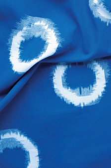
Bold: a statement rug in a strong colour or a vivid Ikat becomes the heart of the room. Bold works best against restrained surroundings pale walls, simple furniture so the dhurrie has room to lead. If the rug is the star, let everything else play a supporting role.
Choosing Dhurrie Colours Room by Room

Different rooms ask for different things from colour. Across the handloom dhurrie collection, these are the principles worth keeping in mind for each space:
-
Living room: the rug ties the seating group together, so match it to the sofa and let it set the room's mood warm and grounding, or light and open.
-
Dining room: favour deeper or patterned dhurries that conceal the inevitable marks of meals; busy patterns are forgiving in a way that plain pale rugs are not.
-
Bedroom: softer, calmer colours support rest muted blues, warm neutrals, gentle tonal schemes that feel restful underfoot first thing in the morning.
- Entryway and hallway: these set the tone for the home and take the heaviest footfall, so reach for richer, deeper colours and patterns that both make an impression and wear well.
Working With Pattern and Colour Together
Colour rarely arrives alone in a dhurrie it comes woven into stripes, geometrics, or the soft-edged repeats of an Ikat. Pattern changes how a colour behaves. A bold colour broken up across an intricate pattern reads as far more wearable than the same colour in a solid block, which is why a vivid Ikat can sit in a room that would never accept a single-colour rug in the same shade.
The working rule is to balance intensity across the room. A strongly patterned, multi-colour dhurrie wants calm, plain surroundings so it can be the focal point. A quiet, restrained room can carry a livelier rug; a busy room is better served by a tonal, low-contrast one. When a dhurrie carries several colours, choose the one you want to amplify and echo it elsewhere in a cushion, a lampshade, a length of fabric so the whole scheme resolves around a single intention.
The Bespoke Option: Custom Colourways

Sometimes the right colour for a room is one that no standard rug quite captures a precise clay to match an existing artwork, a particular indigo to sit against a chosen wall, a colourway scaled exactly to a space. For these situations the custom design service at Shyam Ahuja lets you specify colour and dimension precisely, so the dhurrie is made for the room rather than the room arranged around the dhurrie.
This is the route most often chosen by interior designers and architects, where a colour brief is exact and compromise is not an option. You can learn more about the heritage behind Shyam Ahuja.
A Practical Colour Checklist Before You Buy
Before committing to a dhurrie colour, work through this sequence:
-
Identify the fixed elements — wall colour, flooring tone, and the amount of natural light and decide whether the room wants warming up or opening out
-
Take the tone of your largest furniture piece as your main reference, then choose a dhurrie that shares its undertone but differs enough to be distinct
-
Decide your level of statement — neutral, tonal, or bold and keep everything else in the room in proportion to that choice
-
Order swatches and view them in the actual room, at different times of day, before deciding — colour shifts dramatically between showroom and home light
-
In high-traffic or dining spaces, lean towards deeper tones or patterns that wear gracefully rather than pale solids
-
If no standard colourway is exactly right, consider a bespoke dhurrie rather than settling for an approximate match
A dhurrie in the right colour never needs explaining. It simply belongs the moment it is laid down, and for years afterwards.
Frequently Asked Questions
What colour rug goes with a grey sofa?
Grey is a flexible neutral that works with almost any dhurrie colour. For a calm, tonal scheme, choose a stone, ivory, or pale grey rug. For more energy, introduce a warm contrasting dhurrie mustard, terracotta, or deep teal which lifts grey out of flatness and gives the room a focal point. The key is to share an undertone: pair cool greys with cooler rug tones and warmer greys with warmer ones.
Should a rug be lighter or darker than the floor?
As a general rule, a dhurrie should contrast with the floor enough to read as a distinct layer rather than disappearing into it. A light rug over a dark floor brightens and opens the space; a darker rug over pale flooring grounds and warms it. What you want to avoid is a rug so close in tone to the floor that the two blur together and the rug loses its purpose as a defining surface.
What is the best rug colour for a small living room?
Lighter dhurries in ivory, sand, or pale stone make a small living room feel larger and airier, which is usually the safest instinct in a compact or low-light space. If you prefer colour, a tonal scheme soft, muted shades rather than high contrast keep a small room feeling calm and uncluttered. Very dark or busy rugs can make a small room feel closed in.
How do I choose a dhurrie colour that will not date?
Neutral and natural tones ivory, oatmeal, grey, undyed shades are the most future proof, because they let the rest of the room change around them over the years. A subtle stripe or geometric in these tones gives you longevity and flexibility. If you want colour but worry about longevity, choose a classic, muted version of a shade rather than a trend-driven bright, and remember that a well-made dhurrie is meant to last decades.
Can I use a bold or patterned dhurrie in a neutral room?
Yes, a neutral room is the ideal setting for a bold or patterned dhurrie. With pale walls and restrained furniture, a statement rug or a vivid Ikat has room to become the focal point without competing with anything else. The rule is balance: when the rug leads, keep the surrounding elements quiet so the eye knows where to rest.
Can I order a Shyam Ahuja dhurrie in a custom colour?
Yes. One of the advantages of working with Shyam Ahuja is the ability to commission a dhurrie in a bespoke colourway matched to your room an exact shade to sit against a chosen wall, complement an artwork, or coordinate with existing furnishings. This is especially valuable for interior designers and projects with a precise colour brief.
Choosing the right dhurrie colour is not about chasing a trend it is a decision made on the room's terms. Read the fixed elements, take your lead from the largest furniture, test colour in the room's own light, and let the space guide you toward a piece that will hold the scheme together for decades. Explore the full dhurrie collection or speak to Shyam Ahuja about a bespoke colourway for your home.
